BARRY’S BOOTCAMP
SUMMARY
A two week case study that delves into redesigning Barry’s Bootcamp by restructuring their IA and redesigning UI elements to encourage first time users to follow through in reserving a class.
https://www.barrysbootcamp.com/
TOOLS
Adobe XD
Illustrator
InVision
VS Code
Bootstrap
GitHub
ROLE: UX/UI DESIGNER
User Research
Site Map
Style Guide Redesign
Wireframe
High Fidelity Prototype
User Testing
Problem
Barry’s is a high-intensity workout class that is popular amongst social media influencers and celebrities. It combines cardio and strength training to burn up to 1,000 calories per class.
Despite the intensity of a bootcamp style workout, Barry’s is known for its friendly staff and approachability. The website however fails to align itself with that approachable vibe that the brand and staff carry.
So I believe that first timers at Barry’s are intimidated by the intensity of a bootcamp style workout and are further intimidated by the current interface, leading them to be hesitant to book a class upon arriving at the site for more information.
SOLUTION
I believe that redesigning the UI to a more friendly look and restructuring the IA by streamlining the navigation will encourage users to follow through in reserving a class.
RESEARCH
I conducted interviews with the client and users to gain more insight about the brand and the problem.
After speaking with the receptionist, I was able to find out the purpose of the website.
The 2 primary reasons for the main website is for:
1. First time users come in to find more information about classes and pricing, etc
2. Returning members to reserve classes.
However, she informed me that Barry’s had launched their app last year which was the easiest and most common way to reserve classes.
A interviewee stated:
“I don’t like the flashing graphics. It flashes and changes a little too fast. Looking at it gives me anxiety.”
- Annie Kim
USER PERSONA
Our user Alex Tanaka is a 26 year old marketing specialist living in LA. She sticks consistently with things she likes. She was a member at Corepower Yoga but is looking to intensify her workout. She wants to see more results and really challenge herself.
“If the assumed general population is presented to be very athletic, then I get intimidated.”
STORYBOARD
This storyboard tracks our user Alex from discovery to membership.
USER FLOW
This flow tracks the steps for a first time user to reserve a class,
SITE MAP
I quickly saw a lot of overlap and the use of different words to refer to the same content which linked to the same page.
For example the “reserve” and “studio” in the primary and side navigation both linked to the same page.
So I wanted to restructure the content in a more consistent and intuitive way.
I used sticky notes to visualize and map out the IA.
Color Key:
Pink - Main navigation menu
Blue - Side navigation menu
Purple - Footer
WIREFRAME
CONCEPT
I wanted to elevate the overall design with a modern and minimal style while still keeping the intense boldness of a bootcamp through the primary red color.
I decided to use red as the primary color because Barry’s is known for it’s red studio lighting.
#D73F2E
#000000
#FCFCFC
#3C3C3C
HIGH FIDELITY PROTOTYPE
USER TESTING
My main objective was to test how users felt about Barry’s new branding and if they could easily navigate through the flow of a first time user reserving a class.
Through user testing I was able to see that users easily navigated through the flow but the problem of intimidation did not diminish.
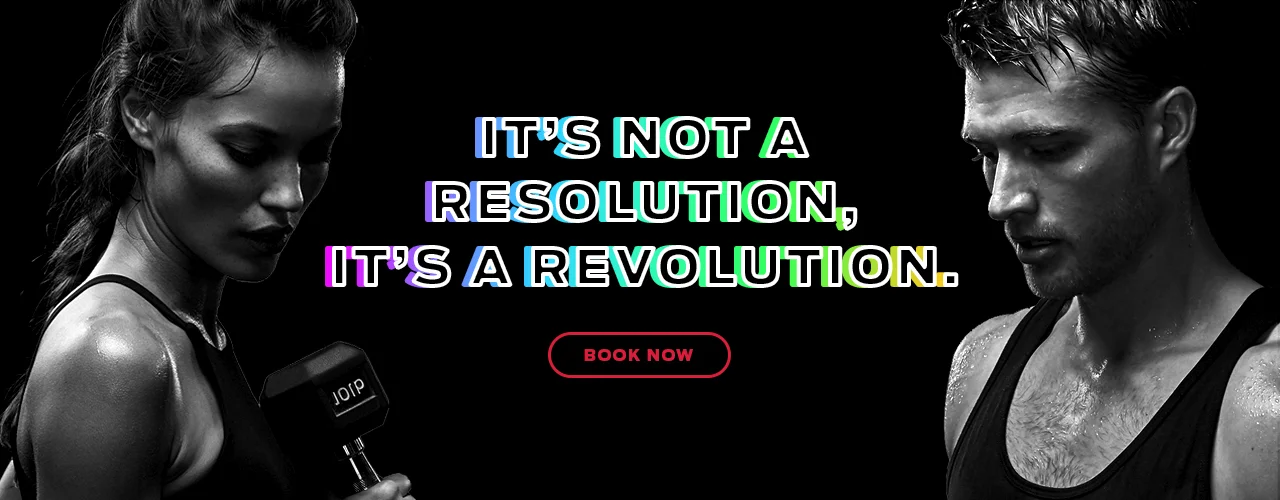
“Ripped trainers in pitch black is not a friendly vibe. People want to see people like them in those pictures because that’s just unattainable.”
I also validated the value of having a CTA button readily accessible on the primary navigation because it allows users to reserve classes without having to scroll or read through all the content.
CODED PROTOTYPE
HIGH FIDELITY PROTOTYPE
FINAL THOUGHTS
User testing was key to the development of this project. I learned it gets really easy to get tunneled vision when designing and having a fresh perspective will help you go back to the problem you’re trying to solve.
Some opportunities for the future would be to
Work with the photographer to produce more relevant images for the main jumbotrons. Due to the constraints of this project, I was unable to find images that were an accurate depiction of what a Barry’s class would look like.
Incorporate testimonials of members and socials to further increase the approachability of the site.


