
HUNDY
UX/UI Design | iOS Mobile App
Summary
Hundy is an iOS mobile app that provides users with an accessible and alternative to request micro-loans in short time frames without the hassle of going through a traditional loan request from a bank or paying incredibly high interest rates.
My Role
I was brought on as a Product Design Consultant to design the Lender release for the app.
Problem
The
Solution
In
Who is the user?
I conducted user interviews to understand who all the users involved in implementation and what the different use cases were.
User Type 1: Borrowers
This is our in-house team heavily involved in the initial implementation. They work in conjunction with the customers to set up the application.
User Type 2: investors
These users give permissions to consultants during implementation and are mainly involved after implementation to maintain the application.


Use cases
In order to account for all the edge cases and scenarios, we mapped out the different use cases to keep track of all the screens that we had to design.


I am a first-time user setting up the application.
Use Case #1
I am a returning user adding or editing a data source.
Use Case #2
I am a returning user fixing an error because my data is not being brought in correctly.
Use Case #3
Goals
1. Optimize Overall User Experience and Flow
2. Unify Language and Error Messaging
3. Align Application with Solver’s Rebrand
User Testing
Method
1 on 1 call
5 Users (3 technical consultants, 1 controller, and 1 accountant)
I hopped on a call with our users and watched them walk through the wireframe prototype.
In our research, we discovered that personal loans are by far the most positively associated type of loan on both the side of the borrower and the lender. Borrowers react positively to the fact that they feel cared for by the lender (this notion extends to also to credit unions vs banks), and the lender feels good about being able to help out another person. Personal loans are also the type of loan that borrowers feel the most committed to paying back, even without official payment plans.
building a community
Since some of our users are likely to be feeling vulnerable, having to ask to borrow money, we wanted to create a community that was supportive and empathetic. Users can communicate with one another in a community setting, give advice about shared experiences and and even help fellow users get a loan. Users who are not able to pass the initial credit check can tell their story and have other borrowers as well as lenders advocate for their character, thus giving them a path to a loan based on personal recommendations within the community.
Goal #1: Optimize Overall User Experience and Flow
Simplify Onboarding Flow
Old Flow
The main use case for Gateway is to set up the application so the biggest change to the flow was simplifying this set up process.
There are currently 3 different login screens required to access the application. Users need to see that the BI360 (now Solver) login is a one-time authentication that is never accessed again after the first-time user experience.


New Flow
I worked with our development team to provide users with a simple access token that recognizes the user’s environment and tenant.
This reduces the number of clicks from 3 to 1.
Make Information More Visible and Digestable
Old Flow
Details of the data source are nested in a drop down.
The source objects page was nested in a drill down page.


New Flow
The new design presents the 3 column layout that allows for information to be read from a scan.

Goal #2: Unify Language and Error Messaging
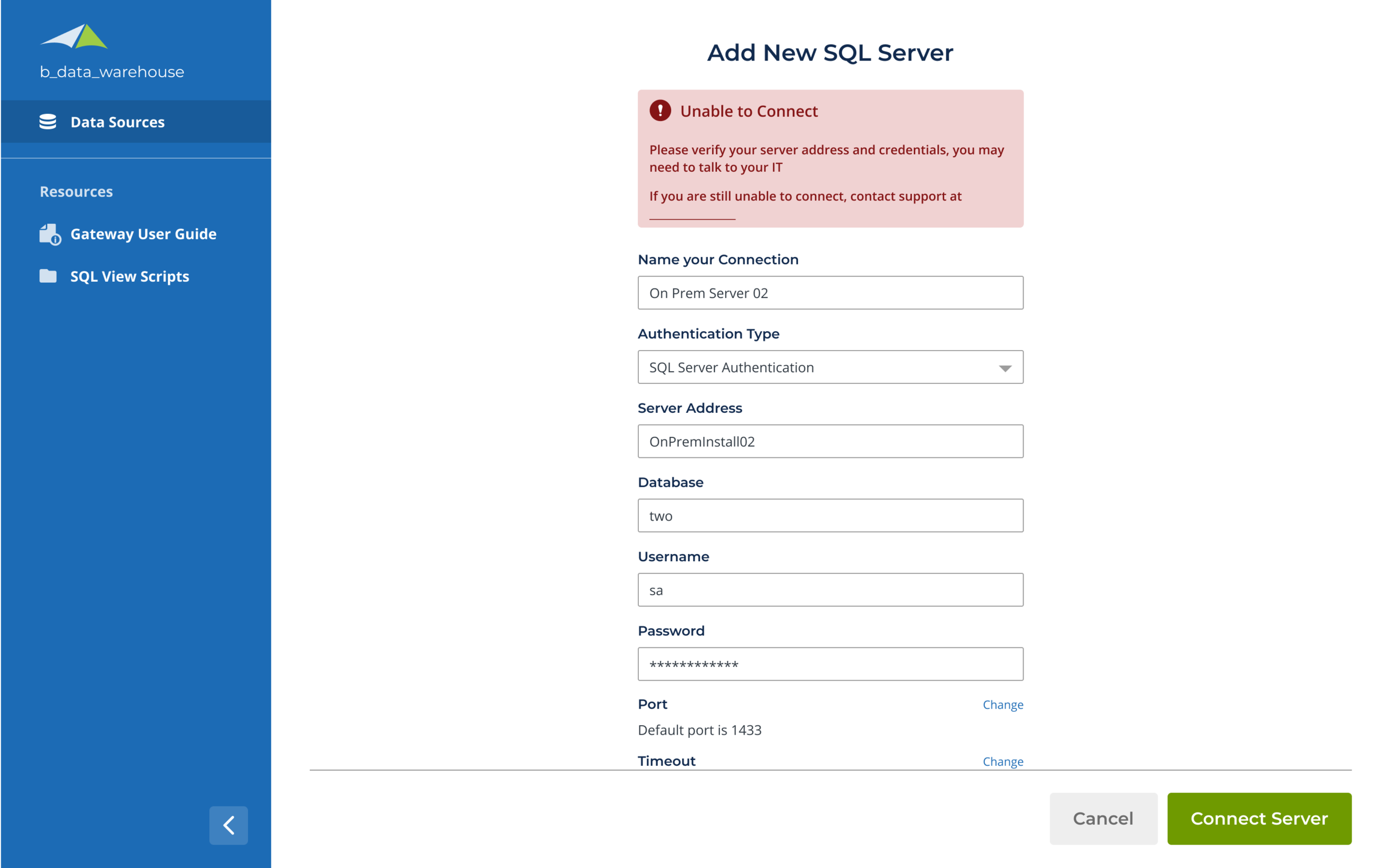
Error messages were very vague and unhelpful so more clarity and context were needed to guide users.
Some developmental roadblocks (on the back-end) due to security issues disabled me from serving specific error messages for the forms. However, I still wanted to make our messaging as clear as possible to guide the users and help them to self-service themselves.
This also mitigates unnecessary contact to our support department.
goal #3: Align Application with Solver’s Rebrand
Branding
The application hasn’t been touched since its first release by the development team so there were a lot of UI changes necessary to align this application with the rest of Solver’s new branding.
We wanted to introduce more graphics to help users visualize what the application was doing and decrease the intimidation of a technical and utilitarian product.
New Design
Old Design


Animation
I animated the welcome screen and the modal to really take our design to the next level.
Add New Data Source Modal


Final design


The FTUE presents a simpler flow for easier onboarding and graphic to help users visualize what the Gateway application is doing.
The new landing page provides a summary of the user’s credentials and environment.
The new side navigation allows for easy access to the user guide and SQL view scripts (these resources were previously emailed from Solver’s Partner).
The copy in the old application was not intuitive for users and was in need for an update to make it industry standard.
All form fields were presented so adding more logic to hide/reveal only relevant information would enhance the user experience.
The 3-column format presents all the necessary information (like the server address, database, added date and objects) in a one-page view.
The data source cards allow a summary view of connection status and number objects being brought in.